

Blessed brew overview
Blessed Brew is a Christian-centered coffee brand with a companion mobile app that encourages spiritual connection and community. I wanted to design a safe space for believers, supporting the christian community in their walk with God through features like testimonies, Bible study, and forums, eventually opening an actual cafe space.
Tools used: Figma, Illustrator
problem
I noticed there weren’t a lot of spaces where Christians could talk openly about their faith without feeling judged. A lot of the community wants a space to ask questions, get advice, and just be able to connect with others who share their beliefs.
solution
I designed Blessed Brew to be that space—an app where people can grow together in faith, ask questions, share their struggles, and dive deeper into the Bible. It’s meant to feel like a cozy digital café where you’re always welcome and never alone.
pain points & goals
Lack of Connection
Lack of Christian spaces
for honest, faith-based
discussions.

description of the comp and why i chose
description of the comp and why i chose
Bible Study
It’s easy to fall out
of the habit of reading
and studying the Bible.

description of the comp and why i chose
Community
Some feel isolated in their
faith, especially in
day-to-day life.

User Research
-
I sent out surveys to get a broad view of what people were looking for in a faith-based app.
98% of participants stated they wanted to study their bible more
87% of participants said they wanted to delve deeper into their faith
64% of participants expressed that they would feel less alone if they had a community to speak to and relate to
This let me know the desire christians had to become knowledgable and meditate on the word. With these takeaways I dove head first into making sure my bible study feature was adequate for users.
-
Talking one-on-one with people gave me deeper insight into their daily struggles and desires when it came to faith and connection. These conversations helped shape some of the more personal features this app offers, like the learning Ai that eventually begins making suggestions on the bible verses and customized bible plans you can take.
-
I used tree testing to make sure the app’s navigation felt clear and intuitive. It helped me see where users expected to find certain features like devotionals or community forums, so I could organize the app in a way that made sense to them.
90% of testers successfully completed doing the daily devotional task
On average it took users 5-10 seconds to find the correct path and finish the given task
On average it took testers 3-4 clicks to finish their task
User Research
PRAY.COM
Lots of study options, very overwhelming

GLORIFY
Daily reminders and spiritual growth but no community

Large communities, strong influence
user journey
The user journey was mapped out to reflect a day in the life of a Christian navigating their faith digitally—from morning devotionals to evening prayer check-ins. Emphasis was placed on ease of access to Bible study, community forums, and personal journaling.

Wireframes
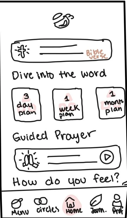
When building the wireframes, I focused on creating a clear visual hierarchy based on what users said they needed most. Features like Bible access, and devotionals were placed front and center to make sure they were easy to find and use. This helped guide the layout and ensured the app felt intuitive and supportive from the very beginning.

Design elements

The color palette leans into warm coffee-inspired tones, grounded by a calming mint blue to bring in freshness and a sense of peace. With the overall components of the app being rounded and keeping an approachable tone.
I chose Brewlogic as my logo typeface because
it gave off the grittiness of coffee and has a hand written quality to it. Josefin sans keeps that written feel as well as introducing clean legibility. Giving the typography and feel of my app a clean bow to tie it all together.
Final Design Desicions
After rounds of user feedback and testing, I refined the design to emphasize clarity, comfort, and connection. Making sure my layout highlighted key features: like Bible study, community forums, and journaling, easily accessible right from the home screen. I kept the color palette calming and consistent, made sure buttons and text were legible and touch-friendly, and focused on keeping the app feeling like a peaceful space users would want to return to every day.


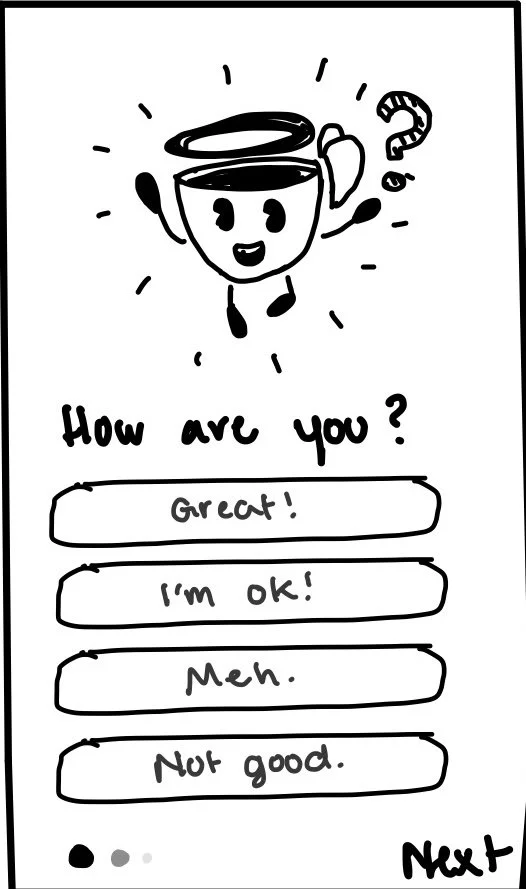
prototype
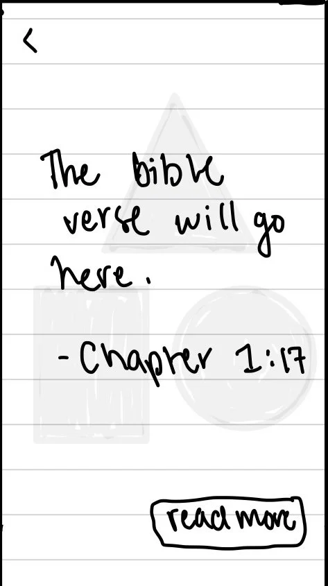
I created a high-fidelity, clickable mobile prototype in Figma that shows off the core features, Bible study guides, community forums, daily devotionals, and a journaling section. The whole experience makes it so people can use it on the go, just like they would check in with a friend or read a quick verse during the day, taking the hasstle away from doing things physically.